
UC Neopet Faeries: The World of Unconverted Neopets!
- Jan 11, 2024
- 32 min read
Hey all! Happy New Year! It's now 2024, and I apologize for not having regular blog content posted towards the end of last year like I had planned to. Life has a funny way of getting away from us! But I both wanted to update you to say hello in the new year, and also to share some exciting news about the upcoming release of the highly-coveted "UC Neopets", formally known as "unconverted Neopets".
Now anyone that knows me knows about my lifelong obsession with the online game and franchise, but for those that don't know:
Neopets is an online game and community that launched a little over 24 years ago where you can make virtual fantasy pets like dragons, gryphons, or other creatures that resemble real-world animals. Over the years, Neopets has undergone many, many changes to its website, including the design of the pets. One such design overhaul happened in 2007 when a majority of the pets were designed to be more consistent in pose and proportions, in order to make way for the "wearables" era. This means many pets that otherwise had unique poses were made to look more uniform.
"Wearables" on Neopets are any item that you can attach to your pet to customize their appearance. This could be anything on them, in front of them, behind them (like a background), or even a fun effect around them, like a glowing aura. Wearables can be bought through Neopoints, which is the in-game currency, or through Neocash, which is purchased with real currency via a gift card or through the website.

Initially introduced as the "Tigren", the Acara is one of the most popular Neopet designs, and
among the oldest as well. It has had several makeovers throughout the site's 24+ year history.
In this conversion process, a lot of the art was retired, and became automatically converted to the new designs. A few pets remained unconverted with the exceptions that you not choose to manually convert it, or otherwise modify its color or species, an ability that is given to you in the game through several mechanics, such as morphing potions. Because a vast amount of people did NOT retain their original pet art, many were heartbroken at the update, and lamented that they missed the old designs. Once converted, there is no way to unconvert a pet to the old art, and no new pets can be made using the old art style. At least up until now...
Which brings us to 2023. While The Neopets Team, abbreviated as TNT, had previously planned to incorporate UC Neopets in some manner for quite a while, the ball really got rolling in 2023, and was confirmed to be upcoming in in early 2024 by the new CEO of Neopets, Dominic Law, via a live stream AMA ("ask me anything"). We don't yet have confirmation on exactly how the new UC Neopets feature but it is speculated that it will be like a Neocash wearable, Meaning, it will cost real-world money, and be an item that you can add or remove from a pet like you could a background or article of clothing.

Oh, and it was also confirmed that another specific feature of the new UC implementation is that UC pets will be initially be released in waves, by specific colors. In the Neopets world, your pets each have a special color assigned to them, which can be changed in a number of ways. The basic ones are generally red, yellow, blue, and green, but there are also fantastical colors such as Mutant, Fire, Baby, Cloud, Christmas, and of course Faerie, which is one of the most iconic and popular Neopet colors! Faerie will be the first color to have the new UC feature. When it is released, we will better understand the mechanics of how this new item will work.
Converted Faerie Pets vs. Former Faerie Pet Art
With the UC feature for Faerie Neopets expected to come out THIS month, I thought it would be fun to make a list of all 55 of the faerie Neopets, and compare their differences! As of this morning, there were several websites where I could go to view the existing options for unconverted Faerie pets, but not a page where I could view all of them- especially side by side. So go ahead and sit back, and let me take you on a trip down memory lane! In alphabetical order, of course. ;D
Note: because some of these pets did not yet have Faerie available as a color at the time of conversion, they have no existing UC art available to compare to. It is unclear if they will get any new special art for their "new unconverted" (a bit of an oxymoron) versions, or if they will simply not be applicable for the UC item. The nine Faerie pets that have no UC art include: Eyrie, Gnorbu, Hissi, Jetsam, Lutari, Mynci, Ogrin, Skeith, and Vandagyre.
Also, with the old art, pets often came with multiple different poses, and the two most iconic poses were generally their "happy" pose, and their "circle" pose, in which the famous yellow and periwinkle circle are placed behind them. The differences of those two poses on a select few pets can be quite different, so I'm including a few of those as little extras in here as well!
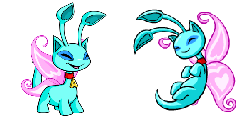
Faerie Acara
First up is the Acara! The poses on these two is pretty vastly different. The unconverted one (right) seems to be almost bipedal, has a much more exaggerated facial expression, a highly dynamic pose, more contrast in lighting, and a bit darker of shades of yellow and pink. While I love the colors on both, the pose on the original art is simply so iconic, I'd have to go ahead and say I love that one! Although, because I do have a Faerie Acara myself, and have her imaginary role as being a magical apprentice or assistant of sorts for a Light Faerie, the colors on the converted art (left) suit that theme a bit more. <3 In either version, the Faerie Acara has received some criticism over the years for being rather plain, and looking too much like a regular Yellow Acara.

Faerie Aisha
Second up is the Faerie Aisha, undoubtedly one of the top most iconic Neopets of all time! This design, however, also is up there on the list of complaints for pets that closely resemble a basic color version of themselves, but with wings slapped on their back. This one closely resembles the Blue Aisha. I don't mind the blue color, but I wish the Aisha collar could be a fun color too as opposed to just red. Nonetheless, it is still a very popular color, with the UC art (right) being especially iconic. The original pose is very exciting and charming, and really shows off the design of the lower wing quite well, also appearing nearly bipedal. While the converted art (left) is more stationary, it is nice that the Aishas mostly avoided the "fist of doom" in their updated counterparts.
Faerie Blumaroo
Third on our list is the Blumaroo, another highly classic pet. Though this one almossst resembles a Blue Blumaroo, I'd give it a pass for at least being more pastel in shade. The UC art (right) is beyond exciting, and is most highly coveted for the fact that it is standing on its tail. You also get a really good look at the paw pads on the feet, which have little hearts! Awww! I also appreciate that the outlines on this art are colored to match the art, giving it a softer appearance. The composition is also amazing, and has a great sense of flow. As for the updated art (left) please excuse the wings. Sometimes the UC pets don't always display correctly on all formats. This newer Blumaroo is flat on its feet, and features the "fist of doom", meant to be able to hold various objects or props from "wearables".

Faerie Bori
Keeping up with the blue theme, we have the Bori next! Thankfully, this one does not resemble a Blue Bori, which is much darker in color. I think this conversion was translated fairly well, although the original art (right) has a more unique pose and expression. The flying poses for Faerie pets are my favorite, because that's what I would imagine them to be doing, having wings and all, heheh. I also like that you can see the end of the tail on the UC version, but also really favor how much of the wings that you can see on the updated art (left). All in all, I really like both versions though! If I had a Faerie Bori, I'd be equally happy with either of these.

Faerie Bruce
Fifth up is the adorable, cuddly Faerie Bruce. This little penguin-inspired fellow is a real cutie in both versions of its art. Although I am a fan of the flying pose in the UC art (right), I wish the wings were more spread out like in the updated art (left). The colors on both are pretty equivalent, and both have really great, cheerful expressions. I do also like that you can see more of the Bruce's tummy on the newer art, because they just look so huggable! It does however have "The Fist", but I think this one is passable! It's not too awkward or distracting to me.

Faerie Buzz
Next we have our buggy friend, the Buzz! This one I think is a great unique departure from the standard Buzz design, having swirly patterns on its body, and altered wing shapes, which resemble that of leaves, and also feature lots of curly, swirly features. The colors are also excellent choices on both. Personally, I'm not a really huge fan of Buzzes (I'm just not a big fan of most bugs, sorry for my bug-lovers out there, heheh), but out of all of the Buzz designs, this one and the Plushie Buzz are among my favorites. Both appear to be in a flying pose, with the UC art (right) just having a bit more energy. The updated art does also have that infamous, "doomed" fist, but I don't think it looks too bad on this design.

Faerie Chia
The Chia is yet another Faerie design that is lamented for resembling a more basic version, the Yellow Chia. In fact, it has even less color, being that its tuft of hair is yellow instead of orange. The wing design is also not particularly exciting, nor does it add a lot of interest to the design. Of course no disrespect to the designers, but I figure this was probably one of the earlier Faerie designs, made before a lot of them became super colorful and elaborate. I wouldn't be opposed to seeing a redesign of it, however, I also respect those that are happy with them the way they are now! The UC art (right) is much more exciting in pose, but I do like the clean, updated style of rendering on the updated art (left).

Faerie Chomby
Next is the Chomby, which I think has a lovely color palette! The original pose (right) depicts it as flying, but like the Chia above, it was also perhaps designed early on, and features an older style of art, with thinner outlines, and slightly more flat shading and rendering. While I think the original pose is cuter, and I like that more of the wings are visible, I do also like how clean the converted art (left) is, and how transparent the wings look! The eyes also look more, well, eye-catching, haha. And look ma, no fist! ;D

Faerie Cybunny
Ah yes, finally! We are at one of my favorite designs, the Faerie Cybunny! Thankfully most Cybunny art was converted in a highly similar pose to its original art, butttt with the caveat of having the dreaded fist. Save for that, I think the updated art (left) is a fairly accurate interpretation of the original art (middle and right). The original art of Cybunny often depicted two versions for its happy look- one with all feet down and eyes open, looking forward. The other happy pose has one paw up, head tilted up slightly, and eyes closed for an extra big smile! I do prefer on the original art how the outlines were colorful to match the Cybunny, giving it a more pleasant, pastel appearance. You can also see more of the wing designs, and the iris of the eyes are a bit bigger than on the new art.

Faerie Draik
One of my all-time faves, I even have an official Neopets plushie of him, the Faerie Draik! I've had a Faerie Draik for quite a few years now (perhaps over a decade old?) but mine was always the converted art (left). The converted art is nice in that the lines are a little more spaced out, and body more "open", with the limbs blocking less of its tummy and chest. I think this gives it s more pleasant aesthetic. However, the original art (right) has such a stunning poze, and really shows off both sides of its beautiful wings. The anatomy is also a little different, have a more "chibi" appearance, almost. I really enjoy both versions of these, but have to say, the whimsy of the original art is just unbeatable!

Faerie Elephante
Here, we have the Elephante. This one is a fun, pastel design, with a lovely wing design! Apologies, this is another Faerie pet whose converted version (left) doesn't always display the wings correctly. on the updated version, I much prefer the cleanliness and clarity of the art. It also has a more fluid appearance, where as the original (right) looks a little more "blocky", in a sense. I do like the anatomy of the original art more, but would like to see it in a less stiff pose, with cleaner rendering. The wings on the original are my preference, however. I also like that its gem is a hot pink instead of a deep red, and even the irises appear to be a peachy pink, where as on the newer art, they appear to be a coppery-orange color.

Faerie Eyrie
Ope! The Faerie Eyrie was actually designed after the conversion, so it does not have an unconverted counterpart. However, there was speculation that this was the original plan for a UC Eyrie design, complete with all versions of its poses. While it is a stunning design, because it was never published as canon, I can't officially compare it with the design below. I do also really love the design they came up with though. So much so that I went out and got my own when getting back into the game! I love that the color palette is different than the usual pinks and purples. Also an interesting choice to give it faerie wings, as opposed to fancier feathery wings, which almost all Eyries have. And that shade of green is just always a stunning choice. Also note, this is another pet whose wings aren't displaying correctly in this image- apologies!

Faerie Flotsam
Ohhhhh... our poor Flotsam friend. Regarded as being among the most underwhelming Faerie designs (sorry! but I have to say it!) and almost resembling a regular Blue Flotsam, this little buddy is not an especially popular color. Its wings are rather uninteresting, and being borderline monochromatic, this design doesn't have a super memorable or unique appearance. I would love to see this redone in brighter colors, perhaps with some designs on the body, and fancier fins, to perhaps push its design to be a bit more exciting. The color palette of the Petpet, Faerie Nuranna, would be an amazing take, I think! But as far as comparing the two, the older art style (right) does look a bit more stiff and dated than the updated art (left), so I actually prefer the updated version.

Faerie Gelert
For our next pet, we move onto the Gelert. Though the Faerie's version is a more pastel yellow than a regular Yellow Gelert, some regard this design to be a little more on the boring side. I personally don't mind it, but I do agree, it cuold perhaps be a little more detailed or exciting. The original art (right) features the Gelert sitting down, which is actually surprising for an OG Faerie design. Most original and converted Gelerts are depicted as standing on all four paws. It does however have the cute little tongue sticking out, and also features cooler-toned, darker purple wings. On the newer art (left), the wings have a softer outline, matching the color of the wings, and appear more transparent. They also aren't displaying correctly on this image, sorry yet again! Between the two, I would prefer the newer version, but I think a more exciting pose could and should exist for the Faerie Gelert in general! ;P

Faerie Gnorbu
Out of the nine Faerie pets that do not have an existing version before "The Great Conversion", Gnorbu is one of them, and the second one on this list. He sure is a colorful fellow though! I like the color of his mane, but the colors are perhaps a bit hard to coordinate. Kudos to those that can pull it off with their wearable customizations though!

Faerie Grarrl
In a rare departure from the norm, despite the Faerie Grarrl's converted art (left) being a less action-y pose, I highly prefer the updated art! Using the site Lost and Pound, I was able to adopt a "stuck" Neopet with the perfect name for a Faerie Grarrl, and was able to morph and paint it into one! The original art (middle and right) do technically have more dynamic poses, but I feel like the angles are a bit awkward, or that he is really struggling to fit within frame. The updated art does not look so cramed, and features slightly brighter shades of pink, which make it look more sunset-like in color scheme. It also has a more charming smile in my opinion, and the wing sort of distracts from the fist, heheh.

Faerie Grundo
One of the more unique designs, we have our favorite galactic friend, the Faerie Grundo! Appearing more akin to the likes of the Starry Paint Brush, or the Eventide Paint Brush, this night sky-inspired look suits this space-dwelling pet just stunningly. The original art for the Faerie Grundo featured two different poses (middle and right). One of them looks a bit different than the updated art (left), showing it facing directly forward, with a big, open smile, and hands up. The updated art however is not too unlike the old art that has the classic Neopets circle behind it. The main differences are that the wings are a little bit shorter, bit wider, and the fingers are arranged in fists. I actually have a Faerie Grundo myself, who is joking inspired by one of my favorite anime characters of all time, Sheryl Nome, aka "The Falactic Fairy", as she's known in the show. For this pet at least, I think I prefer the updated art!

Faerie Hissi
Third on our list of pets that did not have designs solidified and released before "The Conversion-ing", the Faerie Hissi does not have an official UC design. There was, however, a leaked, unreleased Faerie Hissi design done in the old style of art, pre-conversion, which looks quite a bit different than what we have now. Although I do enjoy that unpublished design as well, I also do truly love the official one that they later released. I also happen to have a Faerie Hissi too! I think the colors are just stunning. So far, it is unclear for pets such as these, without any UC art, if they will get any alternate pose for the upcoming UC launch.

Faerie Ixi
Loveable, adorable, and utterly precious, we have the Faerie Ixi! now this one is a UC that people truly get passionate about because its original art (right) varies so much from the updated version (left). Though neither depict the goat-like critter flying, even the sitting pose of the UC art has such a sense of character and movement. It's leaning back slightly, its back legs maybe look slightly wonky (like a half "sploot" position I think?) but the smile and ears being down, and twinkling eyes just can't be matched by the updated art, which looks a bit stern, and less charming overall. Now don't get me wrong, the updated art is lovely too, but personally, I'd only want a Faerie Ixi if it looked like the older version. I mean just look at that face! <3

Faerie Jetsam
Fourth for pets that do not have any UC art is the Faerie Jetsam. Though I really love the exciting colors, it does feel a little reminiscent of the Electric Paint Brush to me. I do like this one more, though! However, I was never that big a fan of Jetsams pre nor post conversion. But, if it is true that they will be redesigning art for pets without UCs, to make them feel equally as included, then if it's done in a flattering way, I might just change my tune about Jetsams!

Faerie Jubjub
The Faerie Jubjub actually has great fortune in that both the original art (right) and updated art (left) aren't too dissimilar, and both well-balanced on color palette and spacing. However, the original art does have it in a flying pose, which always gets bonus points from me, and you can also see more of the wings, which appear to be bigger in proportion to its body than on the converted art. The feet on the UC version are also a little smaller, which I think I'd prefer if I had my own Faerie Jubjub.

Faerie Kacheek
Now... lemme just say that the Faerie Kacheek is yet another Faerie design that gets flack for looking too much like its starter option, the Yellow Kacheek, I actually LOVE the Faerie Kacheek as is! I actually wouldn't change a thing about it, but that's because I also have one, and like my Faerie Acara, imagine it to have a role adjacent to a Light Faerie, so it's the perfect color scheme for that. The Faerie Kacheek is positively precious in both versions, but the older era of art (right) does have the benefit of it appearing to be flying. On the flip side though, I like how the wings look more pastel and transparent on the updated art (left). Both are so cute that I'm currently unsure which I would prefer for my current Faerie Kacheek!

Faerie Kau
Moooving on to our bovine buddy, we have the Kau next! Though I've not typically been a huge fan of Kaus (I don't dislike them, just neutral mostly), I do really adore the colors on the Faerie Kau! The original art (right) and converted art (left) aren't terribly dissimilar in posing, but they are a bit different in their angle and perspective. If I had a Faerie Kau, I think I would actually prefer the updated version. The smile looks a bit more friendly, the hair tuft more coifed, and the antennae and horns more clearly defined. The way the horns line up behind the hair and antennae on the original art make it sort of look like it has a fishing line going between the antenna or something, not sure how to explain it, heheh. I also like that on the updated art you can see more of that cute little tail, and eye's iris is a brighter pink.

Faerie Kiko
For our next pet, we have the Kiko! Though I'm not really a Kiko person, in my personal opinion, the conversion really did a disservice to the Kiko designs. The original Kikos (right) had more circular eyes, of equal size, placed close together, in a cute, nearly cross-eyed expression, with a subtle little grin. They also didn't have a little bump for a nose nor a defined lower lip, and the hands appeared more dainty, with separated claws- no doom fist here! The body shape is also more evenly rounded, and hair on top more curly. On the updated art (left), the single hair looks reminscent of how one would draw a cartoon hair growing out of a mole I'M SO SORRY. The bandages also look a little wonky in regards to perspective on the body. Although I don't really ever plan to get a Kiko, if I had one, I would DEFINITELY prefer the original art, though it is unknown yet if they will update the style to be slightly more modern. The color palette for Faerie Kiko really is gorgeous, and it actually has some of my favorite Faerie wings, but I still currently don't have a desire to own a Kiko. Sorry to all my Kiko fans out there, heheh!

Faerie Koi
Like the Flotsam from earlier in our list, we have another water-dwelling pet that is widely regarded as being an underwhelming Faerie design, resembling that of a basic Blue Koi. I feel like there was a real missed opportunity to do something super exciting and frully with the fins and... whiskers? Although like the Kiko, I believe the conversion did this pet dirty for its updated art (the fists are just soooo not fish-like in my opinion), the updated art (left) did do a lovely job of extending the dorsal fin, which is arguably the most interesting part of this pet, since it has a sort of iridescent appearance with the contrasting pink and blue. However, I prefer how the wings were rendered on the UC art (right), because they look more cutesy, like sort of floppy, and well-rendered. The wings on the newer art look a bit flat and don't have as as pretty of a sheen as the original. Although I was also not a huge Koi fan, I would most definitely prefer the UC version for this one!

Faerie Korbat
Although I've always thought Korbats were cute, I only ever had one, and it was a Mutant Korbat, back on my old, now defunct accounts from when I was a kid, I don't currently have one. They're adorable and charming, but unlike Cybunnies, I thought the amount of white on them in comparison to color was a bit too overbearing, so found them to be a little bit uninteresting. Nonetheless, the Faerie Korbat is still mega adorable, and I actually do like both versions of its art! Both appear to be flying, but the UC version (right) is leaned back a bit, with its feet up, and tail in an S shape. It also has an open-mouth smile, and the wings take up more space on this image than on the converted art (left). The updated art depicts it leaning forward, with a smaller open-mouth smile, and tail in a fish-hook type of shape. The curled tops of the ears are also a little bit harder to notice on this version. While both are perfectly cute to me, I think I'd have to pick the UC version as my fave, because we get to see more of those pretty wings!

Faerie Kougra
ANNNND NOWWWW, IT IS TIME. FOR MY FAVORITE NEOPET. OF ALL TIME. IT'S THE FAERIEEEEE KOUGRAAAAA *air horn sounds* Although there are really too many Neopets to love, the Faerie Kougra is undoubtedly one of the most iconic and memorable in my memory of the game. for years and years and YEARS I dreamed of having one. I did eventually get one, thanks to the Lab Ray! And of course while mine is the converted version (left) I still adore it, and treasure it immensely.
The original art (right) has the Faerie Kougra in a flying pose- heck yeah! Bonus points for that! You can also see more of it's tail, and it has a bit more of the magenta color on its body in comparison to the lilac. The head of the original is a bit more rounded and smooth, which I'm not sure I prefer, but it still has a very coy and pretty little face. I am actually super unsure if I will get a UC version of this, because although I love the UC art because it's up in the air and in a more fun pose, one of my favorite renderings of the Faerie Kougra actually goes alllll the way back to the dial-up age... yes. I'm talking about the OLD art that predates even this UC Faerie Kougra here.
Despite the ORIGINAL original Faerie Kougra looking a bit clunky, stiff, perhaps even devoid of emotion, this design is forever burned into my memory as a symbol- an icon really!- of my childhood. I equate it with the sheer joy of coming home from school everyday, excited to hope online to play with my Neopets, or convincing my mom to take me to Limited Too, a young girls' apparel store, in which Neopets was heavily partnered with, so that I could get myself a plushie or a pack of Neopets trading cards! I do still have my original Faerie Kougra plushie (plus a larger talking one from Target too!) and they still sit in my home on display to this day, because the Faerie Kougra is that special to me. That's why it gets three paragraphs in this blog ;P

Faerie Krawk
Whew, anyways, after all that rambling about Faerie Kougras, let's move on. Next up is the Faerie Krawk. Although I think Krawks are cool, I've never really had a desire for one. Nonetheless, the Faerie Krawk is actually quite beautiful, and has such fun, vibrant colors. It reminds me of a spring garden! While the original art (right) is not too dissimilar from the converted version (left), there are some key differences. The hands & feet on the original are a bit smaller, and it stands more on it's tippy toes. It also appears to be standing more upright, with a slightly arched torso, and has a smaller iris and pupil. I do like that the wings are more visible behind the Krawk on the newer art, but can't help feeling like the wing pattern of the original was a little bit more detailed. I wish on both, however, that they were also a litttle bit more translucent in appearance. They both just look a little too opaque for me. I'm unsure about which one I prefer, but with the UC release coming out any day now, I'll have to come back and let you know where I stand on them both.

Faerie Kyrii
Kyrii is yet another pet that I think is really cool, but never actually had. I am borderline considering getting a Royal Girl Kyrii, but I'm full up on pet slots right now, heheh. Anyways, The Faerie Kyrii also has super fun, bright colors. And if I were to have one for myself, I think I would like the UC art (right) more, because of its dynamic, flying pose, cuter smile, fluffier mane, and it has the curly antennae! Not sure why they got rid of that for the converted art (left). The new art makes this pet look a tad bit grumpy. I know that's how Kyrii eyes are, but they managed to find a good balance on the original art, I think. The new one also prominently features our great adversary, The Fist, front and center. Although I don't completely dislike the converted art, I would most definitely lean towards UC.

Faerie Lenny
Ah yes, time for another one of my favorite Faerie designs! Despite me loving it (like a LOT) I actually still don't have one, because I already have soooo many permanent dream pets on my accounts, haha! For this one, I think I do prefer the original art (right), but I also don't really mind the converted one either (left). I like the wings on the updated art, I just wish the feathers could be straight out, and not posed like fingers. Still, it's not as bad as the Koi fish-fin-fist. Try saying that three times fast, haha. The three whip-like feather tails are lovelier on the original, because they're much longer, being nearly the same length as the fan of peacock-looking tail feathers. Ultimately both are really cute, and although I prefer the original, I'd honestly be just as happy with either version.

Faerie Lupe
Next up is the Lupe, one of my all-time favorite species of Neopets! (Yeah, I'm definitely a dog person, haha.) While some folks do compare this design as being super similar to the Blue Lupe, I think it more than makes up for it in its GORGEOUS and unique wing design, and cohesive range of pastel colors. I have had a converted version of a Faerie Lupe for some time, I believe from a Lab Ray zap. And I love her very much, butttt, I think this is one where I am actually quite excited to try and upgrade (or is it "retro"-grade? haha) to the UC version. The flying pose of the UC art (right) is just too heckin' cute! And the detail on its wings, just magnificent! Also, at the time, this art was an widely-adored upgrade from another dial-up era design, the now "ancient" Faerie Lupe.

Faerie Lutari
Fifth up on Faerie pets with no UC design is the Lutari. Which is a bit of a shame, because the UC Lutari pose was just iconic!! Of course, that's assuming they would have even used the same posing for the Faerie design, and not create an entirely unique one, which was very common for Faerie pets. But the Lutari is still such a relatively "new" pet (it came out in 2006, almost 20 years ago, omgggg) that it only released 6 UC Lutari colors before the conversion of nearly all the site's pet art occurred in 2007. I would LOVE to have UC Island Lutari!

Faerie Meerca
Here we have another long-tailed critter, the Meerca! The Faerie Meerca has an especially unique color scheme, almost akin to the Skunk Meerca. While I do like the flying pose of the original (right) and that the underside of the tail is all white, I think I prefer the anatomy of the updated version (left)? I dunno y'all, I've also never been a huge Meerca kid, outside of playing Meerca chase haha. I do like on the updated version that the antennae are more visible, but don't care for yet another fist pose, and don't know why they opted to make the tail's underside a cream color. Nonetheless, if I had to choose between them, I think I'd actually for the new version!

Faerie Moehog
Next is the Moehog- a pet that I respect and thoroughly enjoy as being a part of the Neopets lore and universe, but one that I've never actually had or wanted for myself. But in spite of that, the Faerie Moehog are among my favorite designs for them. I absolutely adore the color palette and patterning on the wings. If I were to have one, I would totally go for the UC art (right), which has bigger smile and a more exciting pose, as if it is jumping into the air, about to take flight. The tail on the original also looks less like an errant spider than on the converted art (left). And not even cute like a Spyder, just looks like someone attached a real-life, long-legged friend to it, ahaha, sorrrrry for my Moehog fans out there!

Faerie Mynci
The Faerie Mynci is the sixth on this list of pets to not have a Faerie UC design, being released about a year after conversion occured. I don't really have any additional commentary to add here, just.... here it is. Faerie Mynci!

Faerie Nimmo
Man, I don't really think about how many Neopets I was never a big fan of, but the Nimmo is another one still. I do still appreciate them in their own way though! And the Faerie Nimmo is one I actually quite adore, because of its color scheme resembling Jhudora's. The UC art (left) for Neopets is not super different than the original circle art (middle). But the other happy pose for UC Nimmo (right) shows a different expression, with eyes closed, mouth in an open smile, and long tongue sticking out. Because the first two look so similar, I wouldn't personally get this one as a UC unless it looked more like the one on the right. But even then, I think the newest iteration is still a really nice look!

Faerie Ogrin
Like the Mynci from earlier, the Faerie Ogrin was released about a year after the site converted pet art to be compatible with wearables, so it does not have a UC design. While I like the color scheme, I don't much care for Ogrins, butttt if they came out with cute enough art as a way to give it a "UC" option? Well then just maybe, just maybe I'd consider it, heheh.

Faerie Peophin
One of my top fave Faerie Designs is the Faerie Peophin! This is one where I greatly enjoy the art of both, but would DEFINTELY want to get the original version (right)! The pose is more unique, the rendering a bit more detailed, and the wings a bit more visible. Sorry for yet again another converted version (left) that did not display the wings correctly, this version looks a little more basic, but I do like that the outline work looks a bit cleaner and well-spaced out. Both versions are totally gorgeous, but I can't resist the classic look of the UC art here!

Faerie Poogle
A classic cutie, the ever-loveable Poogle is our next pet up for discussion. The original Faerie Poogle (right) appears to be flying, with its head turned the other way. While I think this pose is more fun, I think the execution comes out a teensy bit awkward? No disrespect to the original designer of course! Being a fan of drawing Neopets myself, I know just how hard it is to give some of the simpler pet designs exciting poses because of their round, marshmallow-like anatomy, haha. The updated Poogle (left) is also quite lovely, and personally I would be happy with either version, although I do see the appeal for the UC art to be more beloved. Also sorry, yessss, the updated Poogle also is not displaying wings correctly in this image.

Faerie Pteri
OH BOY. Just what I've been waiting for, the Faerie pet I'm actually most excited to have as a UC version, the Pteri! While both are cute, and I currently have an updated Pteri (left), both versions' poses are just so, so different, and the UC Faerie Pteri (right) is honestly why I got my Faerie Pteri in the first place. In the somehow slim hopes (at the time) of one day having an original feathery Faerie friend. I mean what can I say? The flow of the wings and tail are amazing, the pose and expression are super energetic, and I also prefer the proportions and anatomy of this one. The new one is lovely, and gorgeously rendered, but like the Lenny, has an awkward look with it's "finger-feathers", and is just a less interesting pose. This is for sure first on my list of pets to change to UC art.

Faerie Quiggle
For our next pet, we have the Faerie Quiggle. This pet is yet another one that had versions for its happy poses that varied a little bit more than some of the other pets' two happy poses. While I don't really care much for Quiggles, the original circle pose (middle) definitely has the most charm to me. The other happy UC art (left) is also cute, but I don't enjoy poses with the eyes being closed verses open as much. Not counting pets like Chia hahaha. The converted Quiggle (left) is rendered in a lovely fashion but definitely my least favorite of the three options. The two hairs on top are once again giving me same vibes as the converted Kiko's single head hair. And so once again, SO SO SORRY Y'ALL.

Faerie Ruki
Although I've never had a Ruki, I know that the converted versions are actually quite popular for customization fans, because they lend themselves well to wearing various clothes, being among the most humanoid in proportions. The look especially elegant in dresses, capes, etc. A lot better than Zafaras anyways, who are shaped like triangles, ahaha. The Ruki has very charming and pleasant colors, but because of the way the spots were translated on the converted art (left), its face looks sort of like an uncooked shrimp. Annnnd, I am so sorry yet again for saying that for all those Ruki folks out there. However, that base color could lend itself well, being almost like a human skin tone. Peaches are just always so hard to pull off because if you get a little bit to much in the orangey range, it does tend to look like a skintoned color. So while I actually prefer the posing of the newer art, I think I'd have to pick the UC Ruki (right) for my favorite of these two. Even if it does have a cool flying pose, eheheh.

Faerie Scorchio
Another classic and iconic pet, we have the famous dragon, Scorchio! While I don't have one, I do admire Faerie Scorchios, (and even did some fan art of one!) it is honestly really hard for me to pick between these two. The original art (right) has a much more fun pose and expression, but the rendering style does look a little bit dated. The newer version's (left) outlines are all in black, which makes it look a little heavier and less elegant than the UC art. It also has an unflattering fist pose. But otherwise, I still think it is a nice interpretation. I suppose if I had to pick, I think I'd go for the UC Faerie Scorchio!

Faerie Shoyru
Not to be outdone, the Shoyru is another famous Neopets dragon species that is quintessential to the world building and brand. Popular for its cuteness, and simple proportions that parallels that of the Kacheek or the Poogle, Shoyrus have been a long time fan favorite. I also really love them, and so drew fan art of this precious nugget as well! The Faerie Shoyru had two versions for its UC art, the circle art (middle) which it had a closed-mouth smile, and then the other one (right) which was more or less the same exact pose, but with a notably bigger, open-mouth smile. Either way, I would prefer to have a Faerie Shoyru of either kind from this era of art. The converted Shoyru (left) isn't too shabby by any means, but the flying pose, and larger wings in comparison to its body is what won me over!

Faerie Skeith
Being released several years after conversion, the Faerie Skeith did not debut until 2010, making it one of the youngest Faerie designs. Which of course means there is no UC art. That all said, I actually really love this pudgy buddy, and have a Faerie Skeith, myself! The colors are just gorgeous, the wings are unique (although nearly identical to the converted Techo, which is just below haha- like seriously, it it actually exactly the same?), and it's neither too boring nor too overdesigned. It is still unclear if pets such as this, without any UC counterparts, will be given any alternative artwork to be enjoyed along with the other pets that will have their reworked UC art.

Faerie Techo
While I don't have a Techo pet currently, there are several Techo designs that I adore. Of course, Faerie Techo is on that list! The colors are fun and pop really well, and the wings and antennae suit it well. If I were to ever get a Faerie Techo, I would definitely spring for the UC art (right). Not only is the pose much more dynamic, the wings look a bit more reptilian, and less dragon-flyish compared to the converted art (left). Which also means, less like the Faerie Skeith above, which does not have a converted version, ahaha.

Faerie Tonu
Tonu is an often forgotten about pet, being that it is limited edition, and also just not overtly popular in general. Although I think it has good character and design, I don't really find them to be appealing as pets. Nonetheless, the Faerie Tonu has gorgeous colors! And if I were to choose between the old art (right) or the converted art (left) I would go for the original, because of how much more action it has, and that the silhouette is more broken up compared to the solid block of Neopet that is the converted Tonu, ahaha. You also get to see more of the wings on the UC art, and the tail has a much longer, more elegant looking tuft of hair.

Faerie Tuskaninny
Tuskaninny is another pet I've never owned, but I do like its unique coloration for its Faerie design. This is also one where if I had to pick, I'd go for the converted version (right). Although it is in its uniform pose, I think the newer one looks a bit more charming, and has a stronger, more satisying silhouette. Though the UC art (right) is more dynamic, I don't much care for the execution. It looks sort of hunched over, and where the tail meets the fins is a bit awkward looking to me too. The hair tuft also looks sort of clown-like. Gahhh, sorry to the Tuskaninny fans! I don't mean to be rude about your fave, ahaha.

Faerie Uni
Now here is one that I am eager to see what they do... because the converted art (left) (and also, not displaying wings correctly again) (yes, I'm abusing the parentheses in this blog) is actually quite similar to the non-circle classic pose for the Uni (middle). Although the original Uni's pose has a bit more roundness to the lines and shapes, larger wings, and more flowy hair, I'm not sure it's different enough for me to spring for a UC on it. Howeverrrrr, if the UC art were like the original circle pose (right), then COUNT ME IN! The circle pose is the whole reason I love Unis. They just look sweeter, more demure and in the case of some Uni designs, like Desert or Darigan, slightly less goofy, and more assured, or even threatening. But I will say, I am big sad they turned the converted Uni's horn gold. While it doesn't look terrible, I like that the original one's horn was more cohesive in color, and it doesn't distract from rest of the face.

Faerie Usul
Another abundantly popular and classic Neopet is the squirrel-like Usul. Most famous for appearing in several plots as major characters and being prevalent around the site in general, famous Usuls such as Hannah, Garin, Gilly, and the infamous Emo Usul shopkeeper solidified this pet as a huge icon for the Neopets brand. However, being that there are many fans of this furry friend, several often note that it has a somewhat underwhelming design in comparison to the other Faerie pets, nearly resembling the colors of a basic color Usul, despite the mane and accessories being a lovely shade of pink.
General design critique aside, the two poses below have quite a large difference in appearance! The original art (right) shows a super-cheerful pose of an Usul flying above us (as the perspective would appear), and its tail is featured prominently in front of its body. The rendering style, however, does look very dated, and a little clunky in my opinion. So I like the smooth roundness of the updated art (left), although would prefer it be in a more dynamic pose. So if they choose to update the "new" UC art to be more like modern standards for Neopets' aesthetic, I think I'd choose that one. But for now, converted is actually my choice here!

Faerie Vandagyre
Out of the currently 55 Neopets that exist, the most recent one to debut was the Vandagyre, although it did debut in 2014, about a decade ago, heheh, so I use "recent" comparatively here. The Faerie Vandy did not release until 2016, making it the youngest Faerie Neopet design. Therefore, the Faerie Vandagyre is the ninth and final Faerie pet to have no UC counterpart. The colors are reminiscent of the Faerie Gnorbu from earlier, but the wings look once again recycled from the converted Techo. Hmmm, never noticed that until now. While it looks good, I wonder why they opted to put the same wings on three different pets without doing any real changes. Faerie wings aren't particularly hard to come up with, really. Ah well!

Faerie Wocky
Wockies, though cute, have never been a top favorite of mine. I love that their designs are so versatile for many types of characters, and yet I've never committed to having one. However, if I were to have one or two, it would definitely be the UC Faerie Wocky (right), or the UC Darigan Wocky. The converted art (left) just doesn't have the same elegance and candor of the original Faerie Wocky. The UC art seems to be almost glowing in sunlight, has a much more charming expression, and really gets to show off its fluffy mane and tail. I would most certainly go for the classic design if I were to get a Faerie Wocky.

Faerie Xweetok
We are nearing the end of our list of all 55 Faerie Neopets, and one of the site's cult classics is the Faerie Xweetok. Ever since its debut, the Xweetok has been a divisive design in the community, with many people becoming big fans of the species, and others, wellll, not so much. But of all of the Xweetok colors so far, the Faerie definitely stands as the most popular, even among folks who don't normally care for the chipmunk-like creature. Being that I had no original attachment to the UC Faerie Xweetok, since it debuted at a time that I was on hiatus from Neopets, I almost prefer the updated art* (left). The UC art (right) has a more dynamic pose, but I don't care much for the silhoutte. If it were rounder, like the UC Techo, I might have loved it, but right now the silhouette has a sort of diagonal egg shape that I'm personally not crazy about. The wings also actually appear smaller on the UC art, which is the opposite case compared to most other pets.
*If it weren't for that darned fist again, ope!

Faerie Yurble
Second to last for Faerie pets, we have the Yurble! I really adore the colors of the Faerie Yurble, I think they're one-of-a-kind, and suit the personality well! If I had a Faerie Yurble, I'd certainly go for the UC art (right), although I also wish the silhouette were a more satisfying shape, as opposed to the top-heavy trapezoidish silhouette it has currently. As for the updated art (left) except that it once again has two unflattering fists, and the wings are yet again not displaying properly ahaha. I'm also sad that they packed the curly ears back into their cinnamon roll shape. I really love the curly look of the original design.

Faerie Zafara
Annnnd of course always last (alphabetically), but never least, is the Zafara! Easily in my top 10 fave Neopets species, the UC Faerie Zafara (right) has been a dreamie for me ever since I was a kid! I'm DEFINITELY going to get me one of these for sure! I just love how the ears are positioned, and how much of the wings you can see, the pose is way more exciting, and has much less of that bottom-heavy-triangle proportion. Also, NO FIST! The eyes and smile also look more engaging on the original. Everything about it is just perfectly precious. The updated art (left) can't hold a candle to the original, sorry to say. Though the colors and wings were rendered beautifully, just look... look at the original's absolute peak design perfection. This one is no contest!

That's All! For Now...
SOOOOO there you have it! All 55 Faerie Neopets reviewed in comparison to their "old" unconverted art. It is speculated that we will get "new" unconverted art by bringing the original images into a more updated rendering standard, while still keeping the pose as close to the original as possible. We haven't seen this for sure, but we will for sure know very soon! Look forward to it! Keep an eye on Neopets' social media channels such as Instagram to stay up to date with the news when it launches. ^_^
~Momo Kariño


Comments